Logo type faces
| This brands logo works with type for the name and the imagery. It is a medium weight font with circular curves throughout. I think the font works well because it portrays the feeling of elegance and class, as is the brand. The serifs make the font look powerful and the curves throughout the 'g', 'u' and 'c' help to make it look more feminine and approachable. |
Clever Logos


All of these logos have come a long way since they were first designed. Generally as the companies have become more famous they don't need to have their brand name on the logo because people can simply recognise them from simple imagery.

 |
| This logo says 'noon' is the use of two horizontally placed '2's. It uses digits disguised as letters. Because they are in fact 2's instead of 'n's your eye automatically follows the shape of the number two, which can be quite straining on the eye. Even though the logo is very visually appealing, it is not very clear as to what the brand is all about. |
 |
| This logo uses mind tricks to make your eye fill in the blanks. It draws your eye in to try and make out what you are in fact seeing. Once you have figured out the logo it is very hard to think backwards and see it how you once did. |
 |
| Again this is a play on lettering and it makes your eyes fill in the blanks. It is all to do with the leading. The logo works well because it is bold and in caps lock to relate to the seriousness. |
 |
| This logo uses type as imagery making the legs on the individual letters become the bandages on a 'mummy'. The fact that the type face is bold, white and condensed works well to help create the effect of lines from the bandages. The 'y' is a key letter as it has been extended to represent the end of the bandages. |
 |
| This logo has used the relation between twins and the number two, tilting the number two on its side to represent the letter 'n'. The '2' has had serifs added to the left leg to accentuate the fat that it is a 'n'. I feel the colour and typeface of this logo haven't been considered greatly when being designed. The logo could work better possibly with a more childish/ handwritten style typeface... |
 |
| UP - This font uses the integration of letterforms to create both an image and a logo. To make it more obvious that they are the letters 'u' and 'p' where the bottom of the leg of the 'p' meets the curve of the 'u' the corners could be sharpened to emphasise the joining of the letters. |
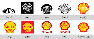
Developed Logos


All of these logos have come a long way since they were first designed. Generally as the companies have become more famous they don't need to have their brand name on the logo because people can simply recognise them from simple imagery.
 |
| I really don't like this logo design. I think it gives of completely the wrong idea. At a glance the image logo looks like it is something to do with an airline or a motorbike company. It doesn't portray elegance and women's fashion because there are no feminine curved lines and the image logo relates too closely to silhouettes of other objects. |
 |
| I really like the look of this poster however the hierarchy isn't very well thought out. The title 'love what you do' is all you can read form a glance and to many people wouldn't mean anything. You need to know what it is advertising in order for the audience to be further engaged. |
 |
| This logo design gives of completely the wrong idea. From a glance I would think that it is for a juice company or some kind of fruit company because of the use of the lemon, whereas it is actually the corporate identity for a Mexican food restaurant in New York. |

 |
| This poster is far too cluttered and cramped. I understand the designer wanted a lot of blank space however it has now been made far too hard to read all of the text that he has put on there. The line spacing is really low and so the text overlaps one another. |
 |
| This looks like quite a cheap design job. All of the type is the same size and the type that is a different point size is so small it is not readable. There are black strips across the page which slightly confuses me as it looks like bits of information have been taped out and so I am not getting the full story. It is therefore not an event I would want to go to because what if the important information has been taped out? |
Great Type Works!
ReplyDelete